Faberlic Alform
Packaging, Identity, Illustration
2020
Alform is a line of health supplements created by Faberlic, one of Russia’s most prominent cosmetic companies.
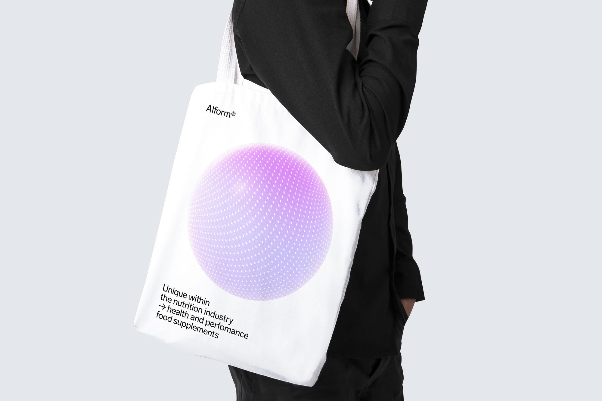
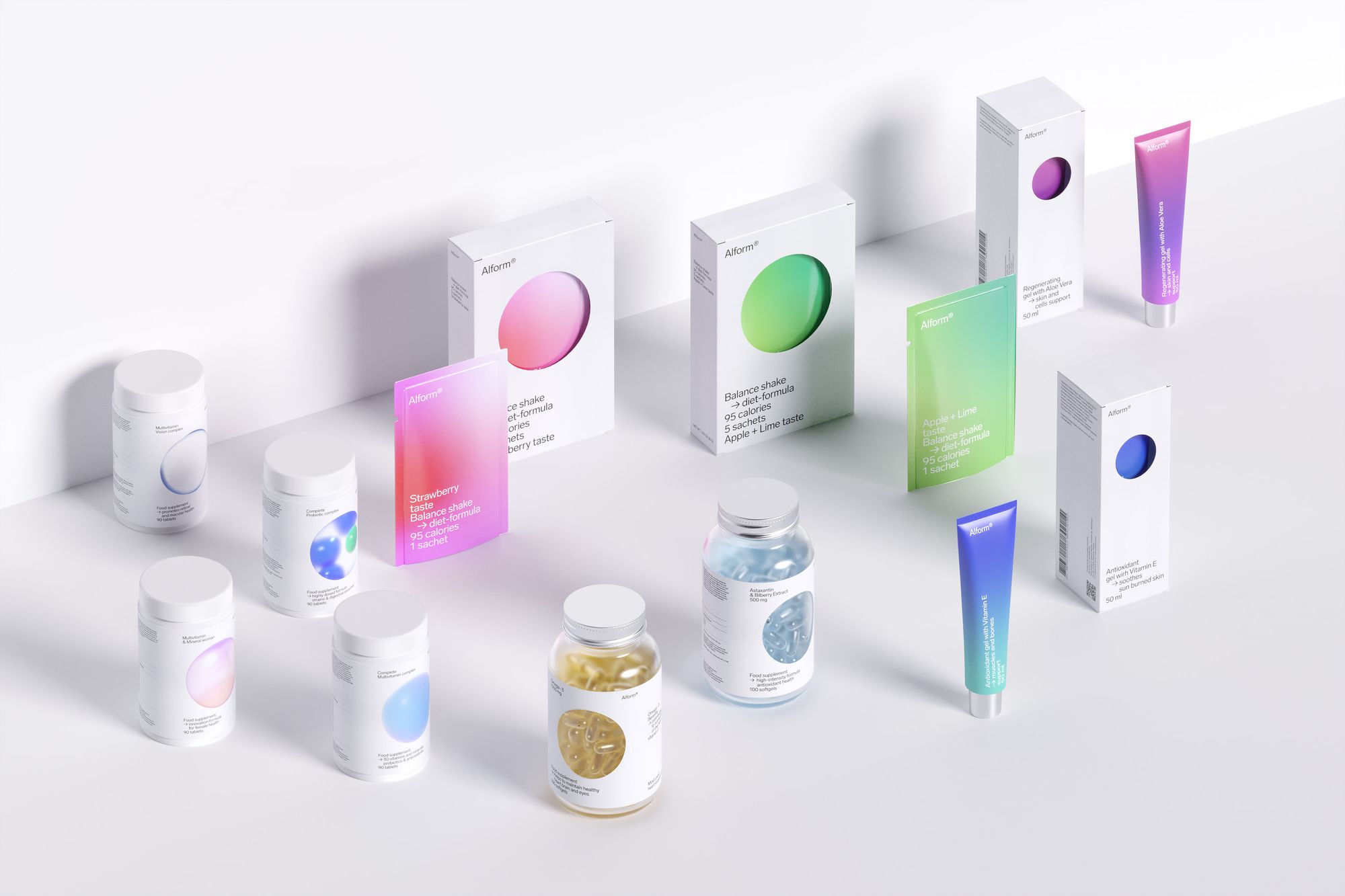
Alform is a brand of health supplements by Faberlic. Its essence is defined by an innovative approach to maintaining the immune system healthy. Alform focuses on creating the most effective formulas to support the body in good shape. The product line ranges from vitamin complexes and gels to diet shakes. Our challenge was to design the look of the new brand and to come up with its name.
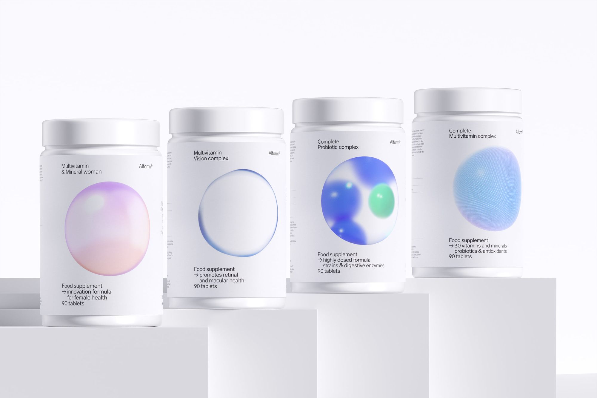
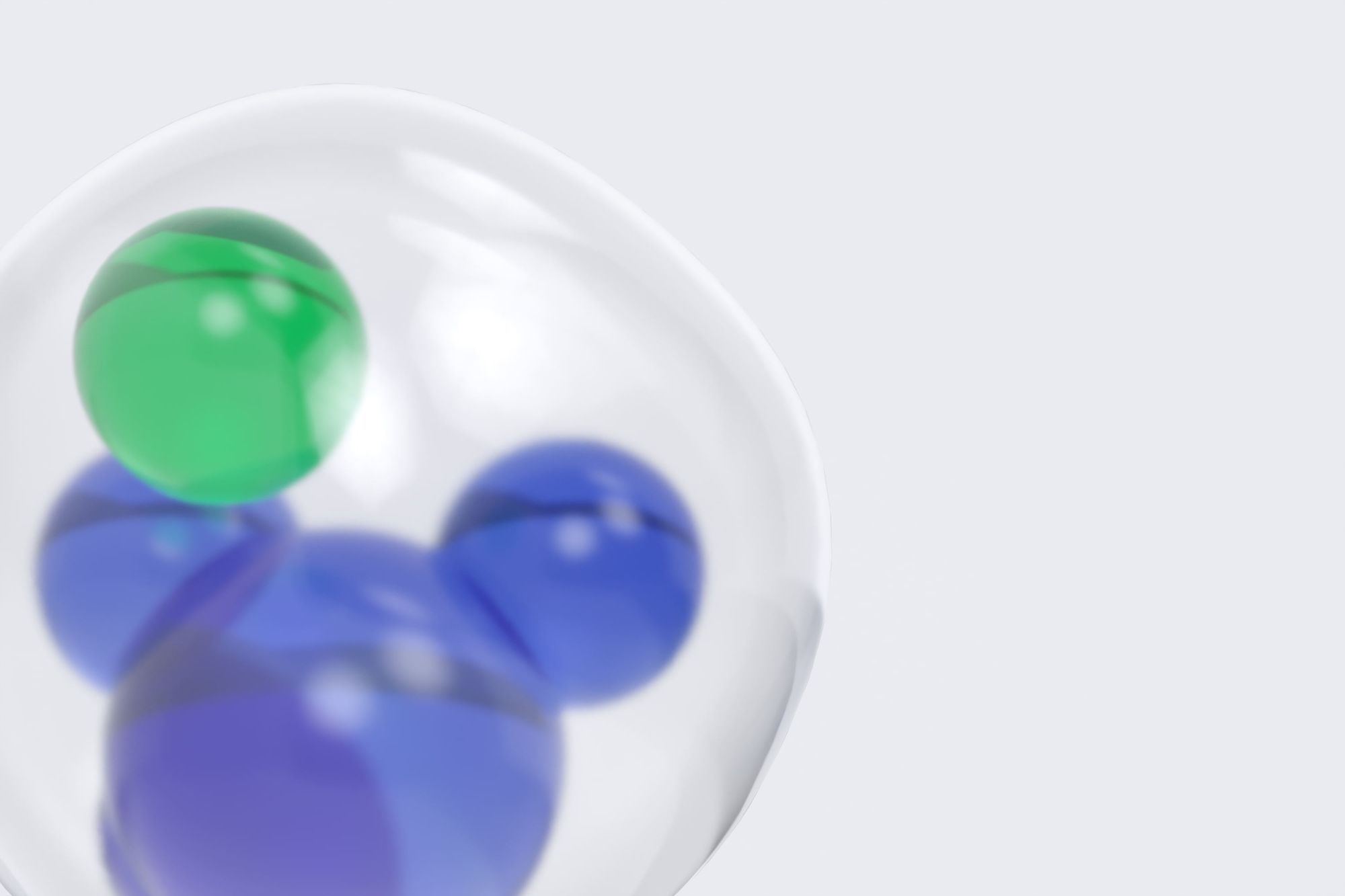
The idea was to create a minimalistic and straightforward design. For the plastic bottles' packaging, we used 3D illustrations of a cell as a base. Simple at its core, a cell is a fundamental building unit of all living organisms on the planet, and it has a kind and positive connotation associated with health. Each illustration visualizes a particular vitamin complex that supports a specific body system. The products in white boxes don't belong to a specific system; in this case, the color scheme becomes a gradient, and the illustration of a cell reduces to a circle. The circles are made with a die-cutting technique so that you can have a glimpse of the inside's product.
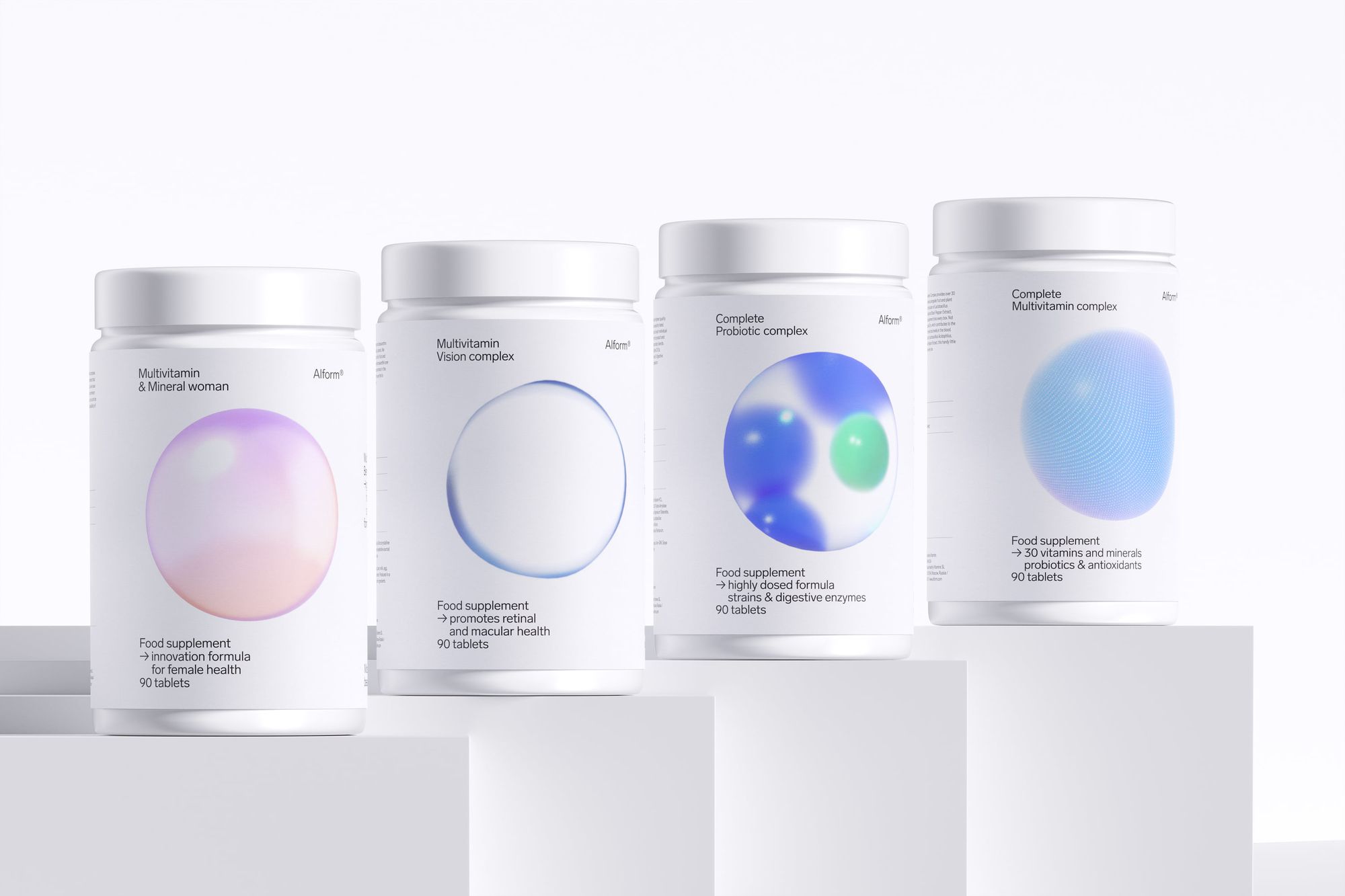
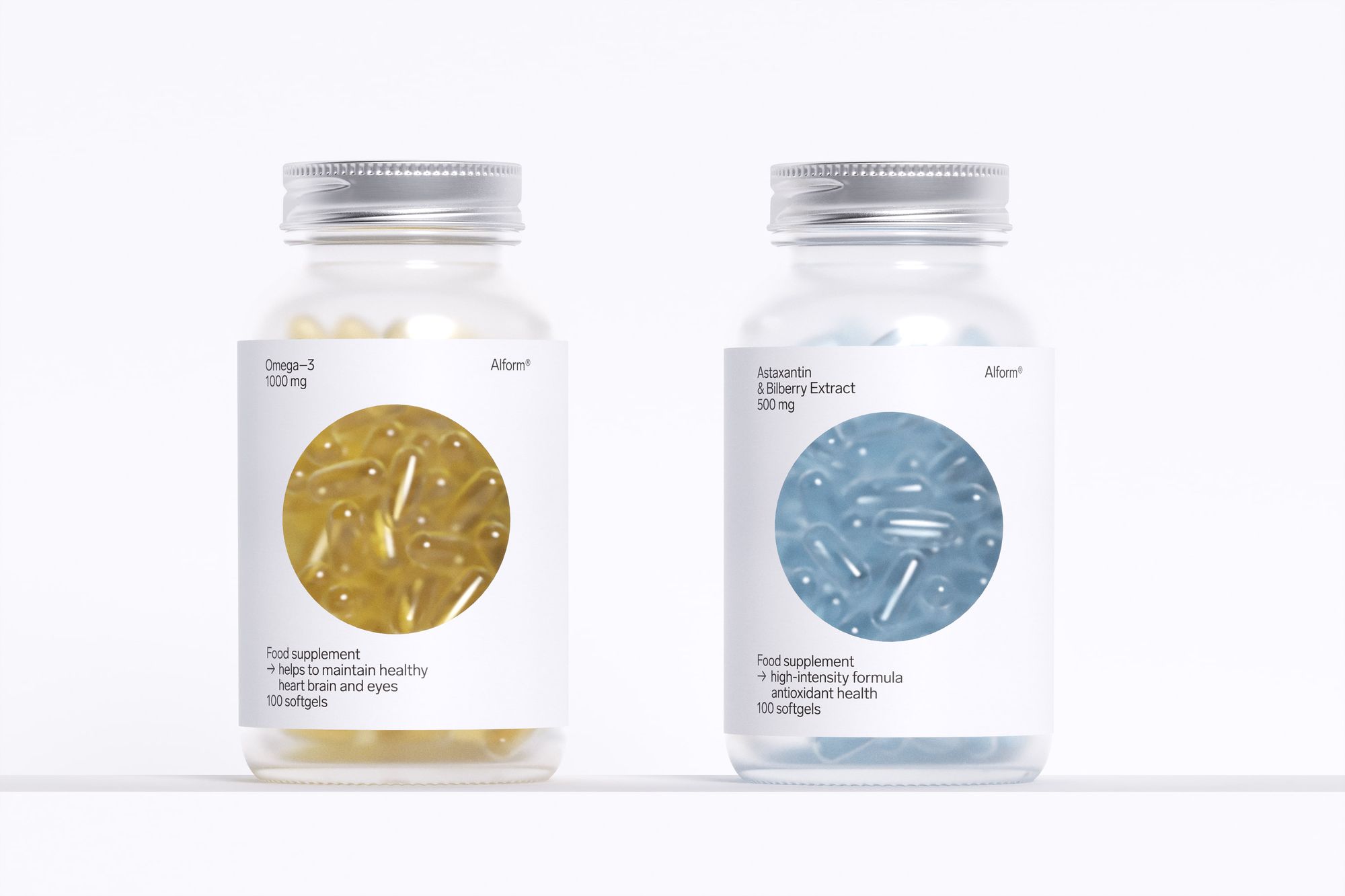
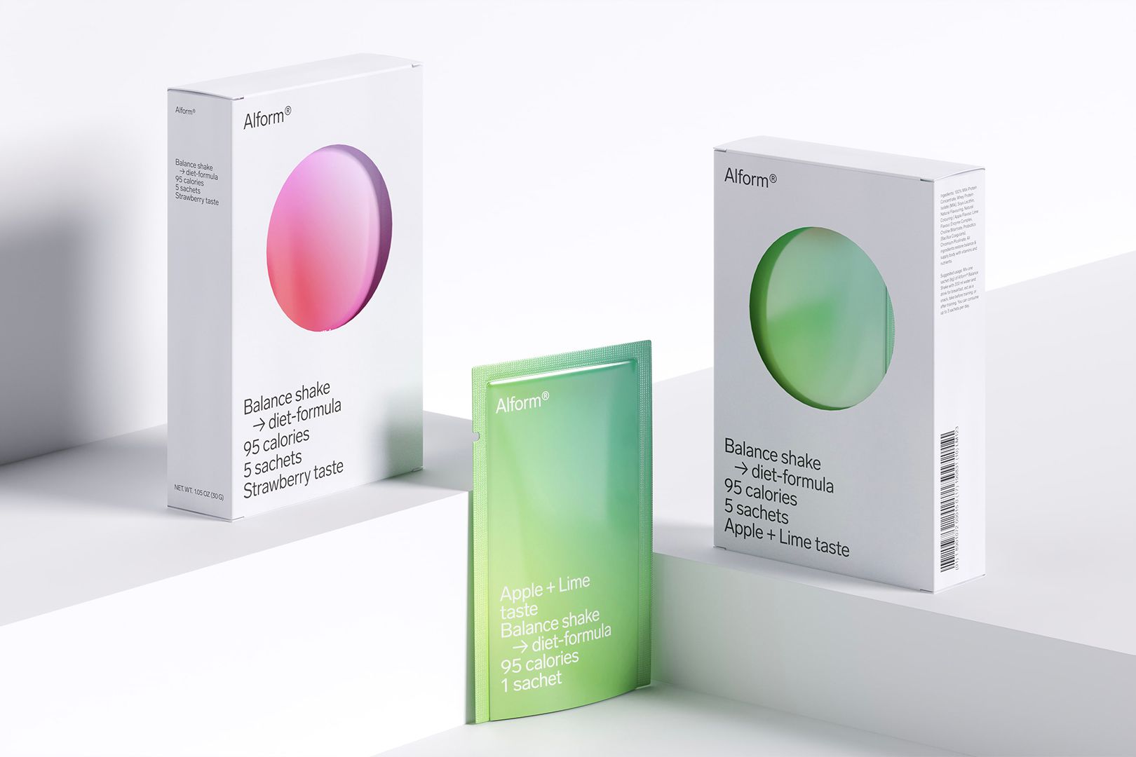
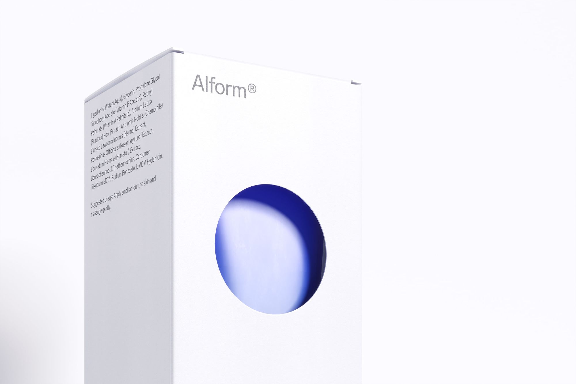
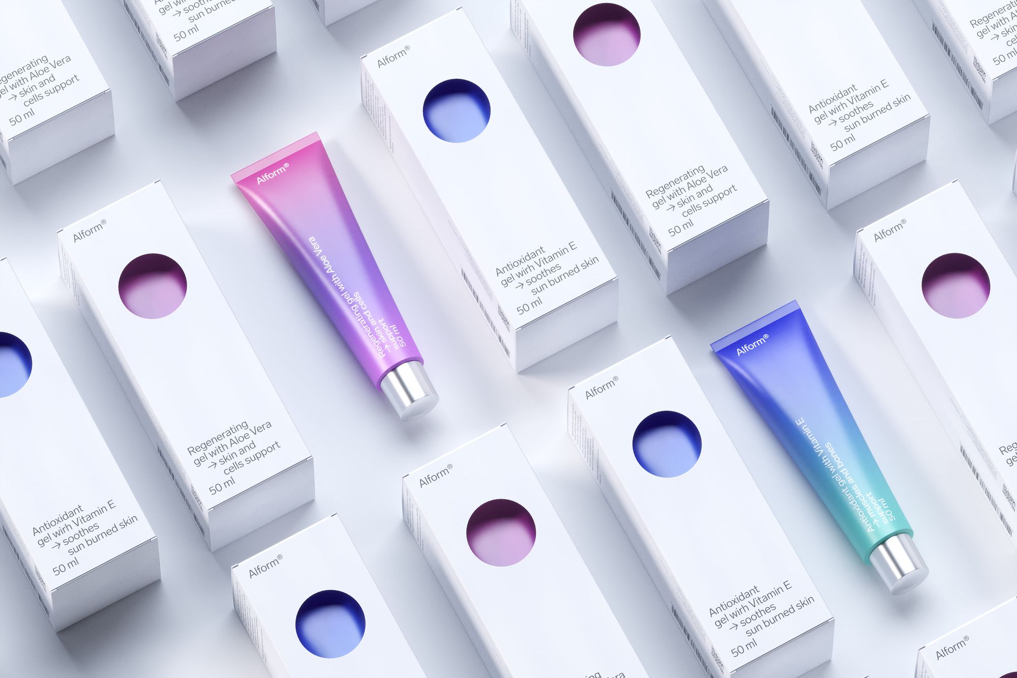
Crispy white paper, combined with rigid functional typography, creates a beautiful contrast with the 3D cells and gradients. The result is a clean, precise, and slightly futuristic brand that embodies Alform's scientific expertise in creating their products.
Art Director & Designer
Marina Kondratenko
Senior Designer
Anna Kabanina