Omela
Identity, Print Production, Packaging, Social Media, Print
2023
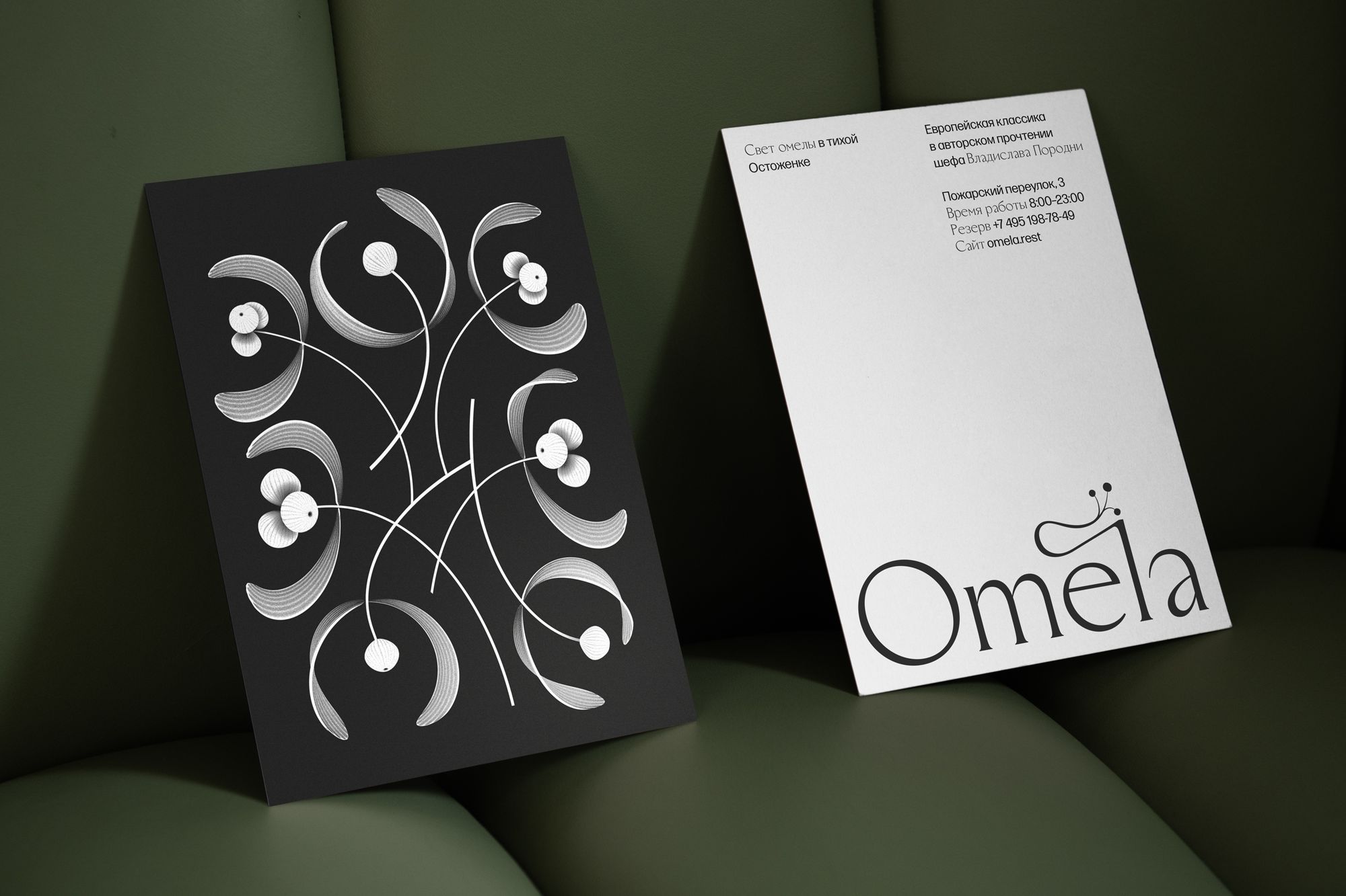
Omela Restaurant's identity, inspired by the celestial Omela plant, exudes grace and rebirth.
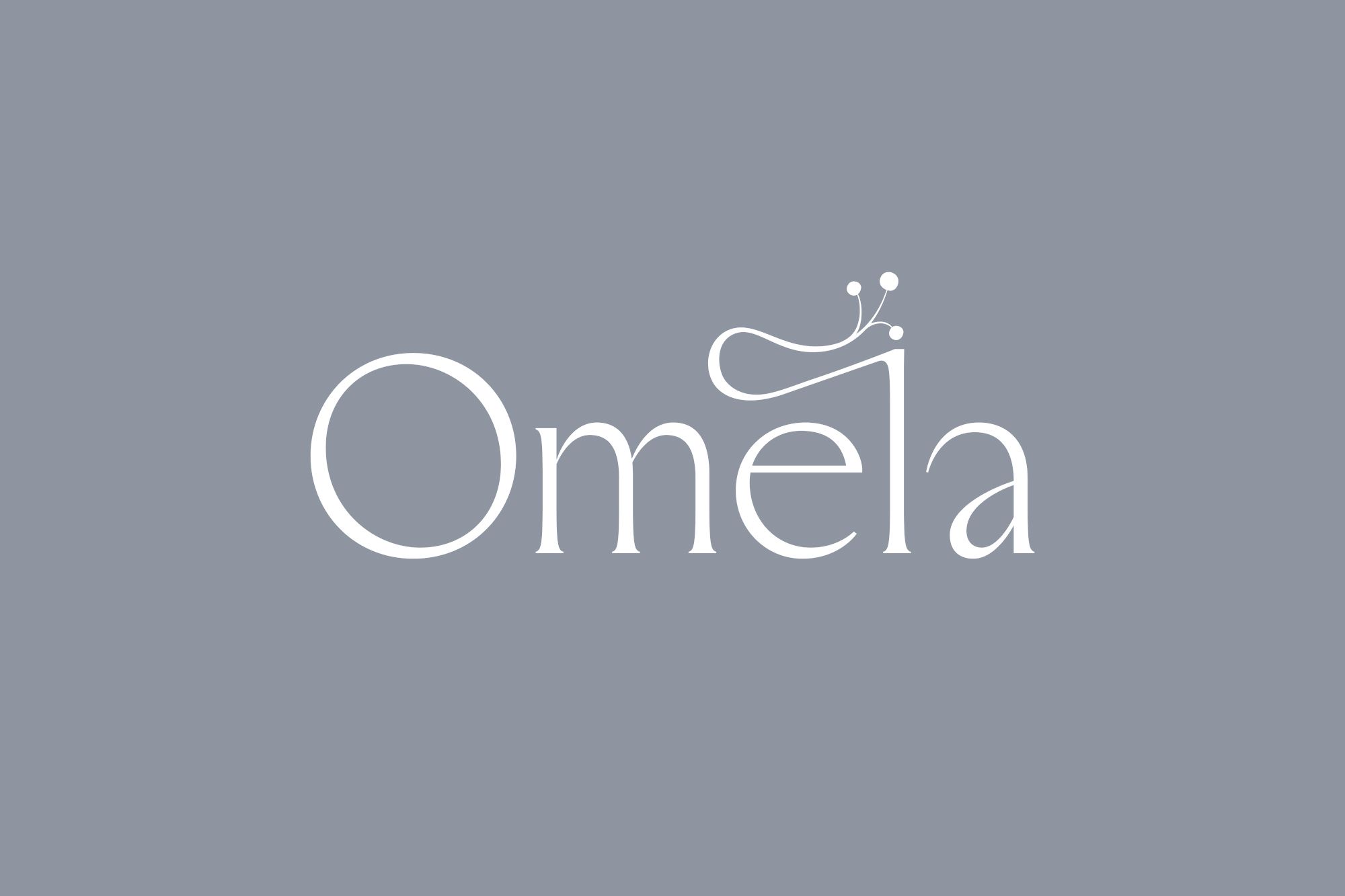
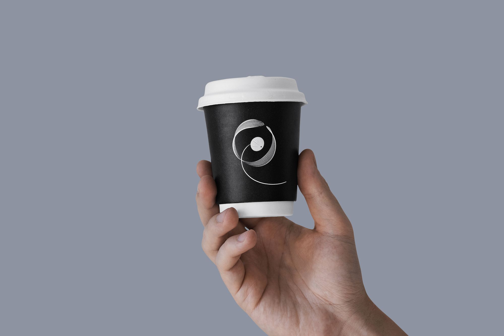
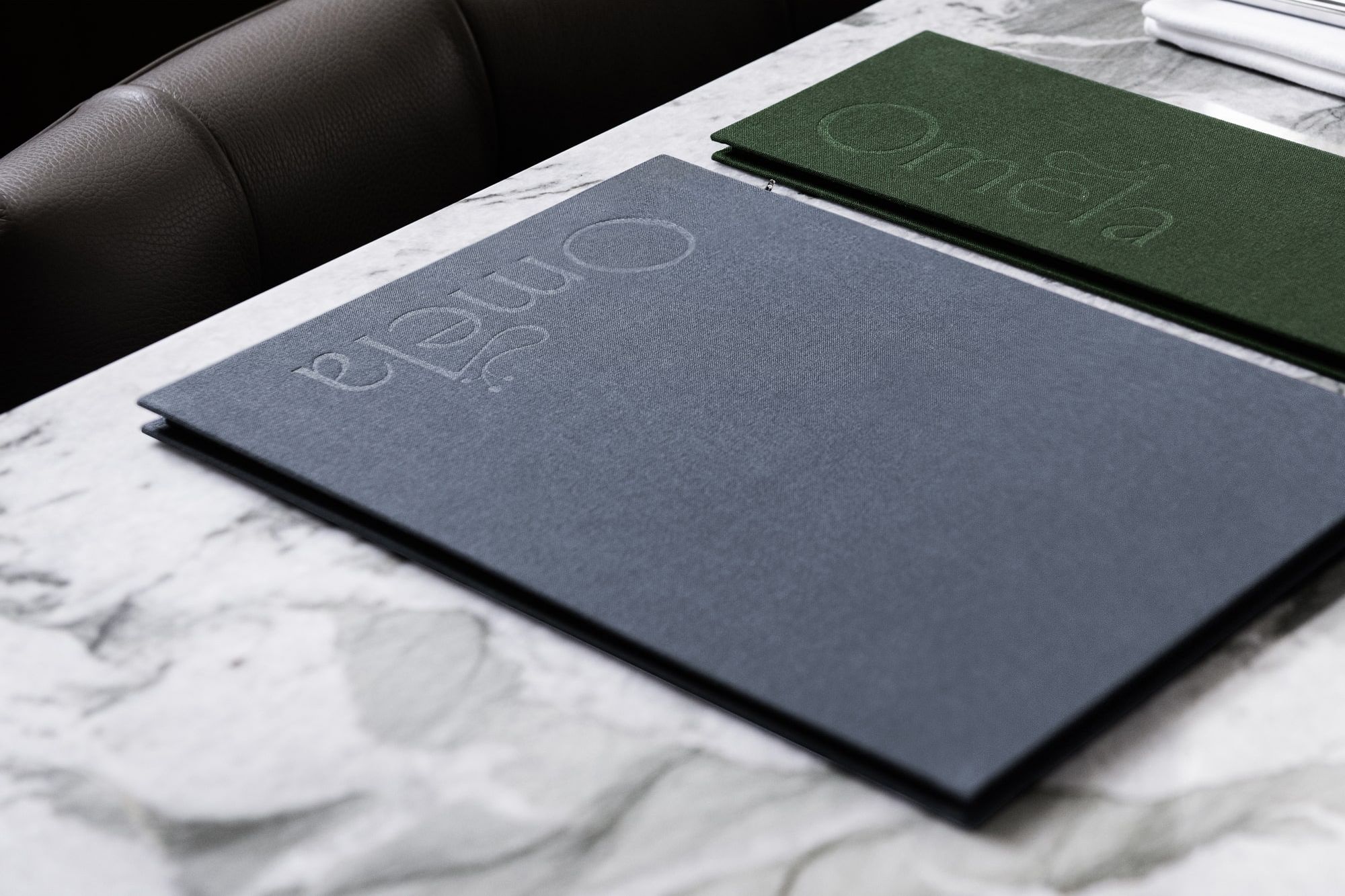
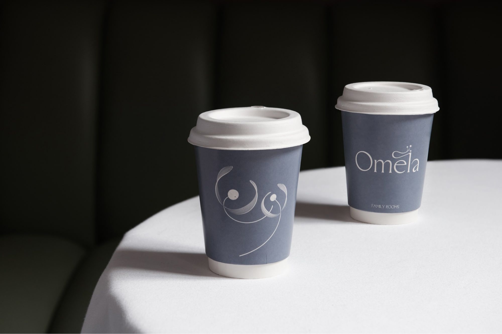
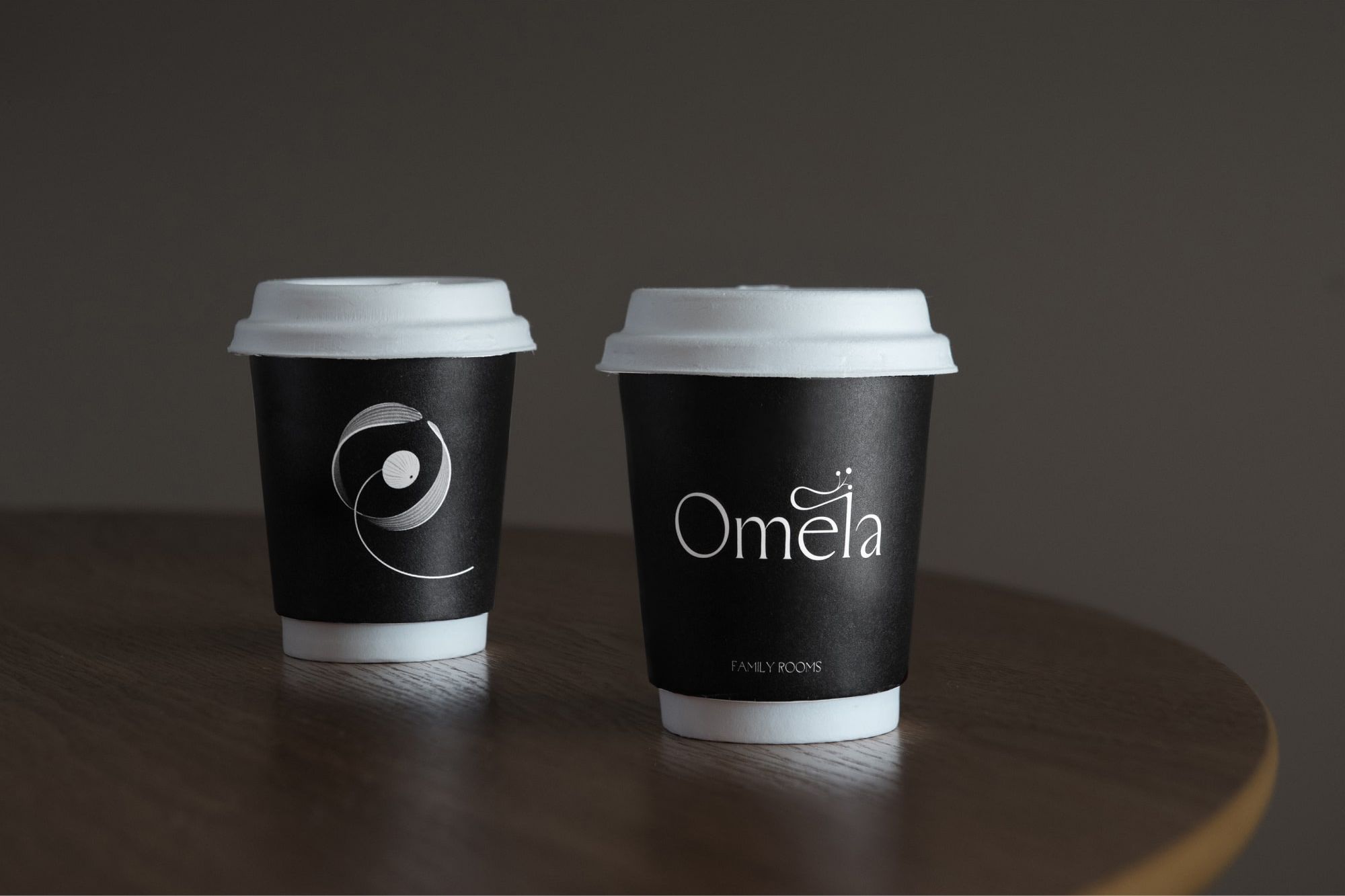
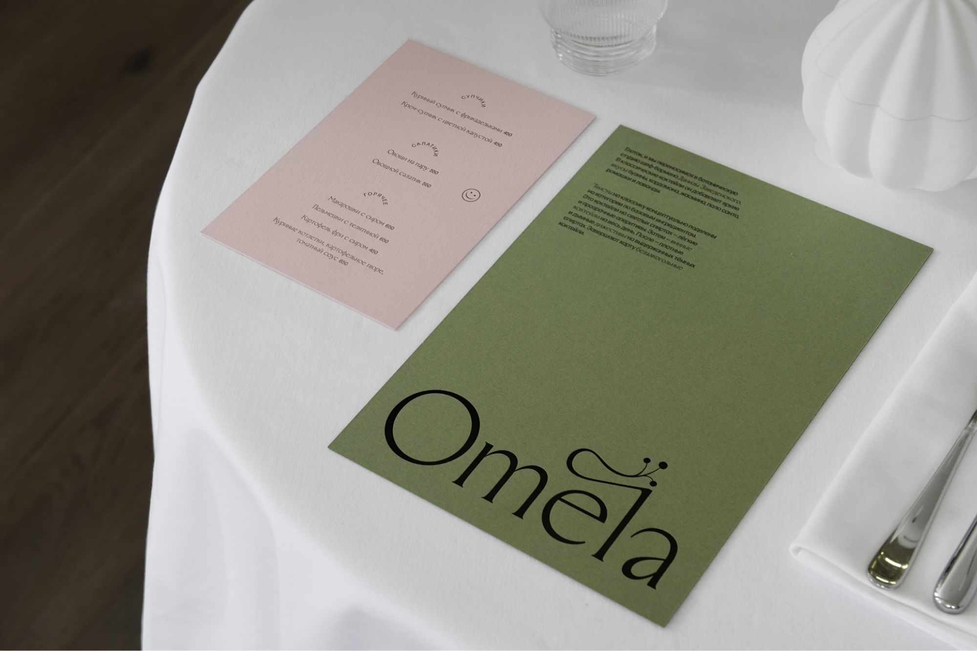
Our journey began when the client introduced us to the brand name "Omela" – a celestial plant known to flourish on trees. Rooted in ancient legends, this plant symbolizes rebirth and the fervor for life itself. Our challenge encompassed the development of an identity system woven around this concept. The outcome was a logo that encapsulates the grace and essence of the Omela plant while preserving its inherent fluidity.
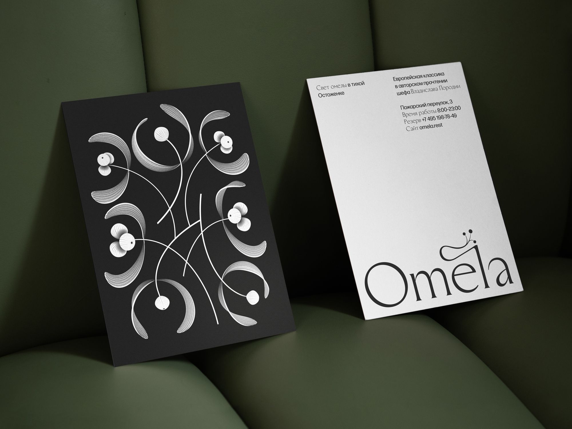
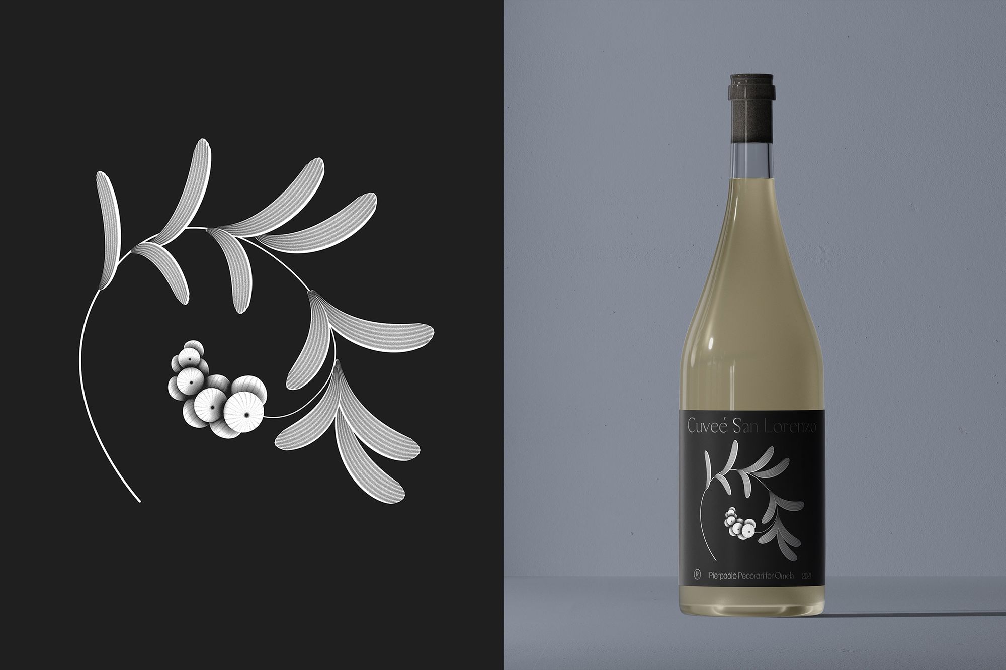
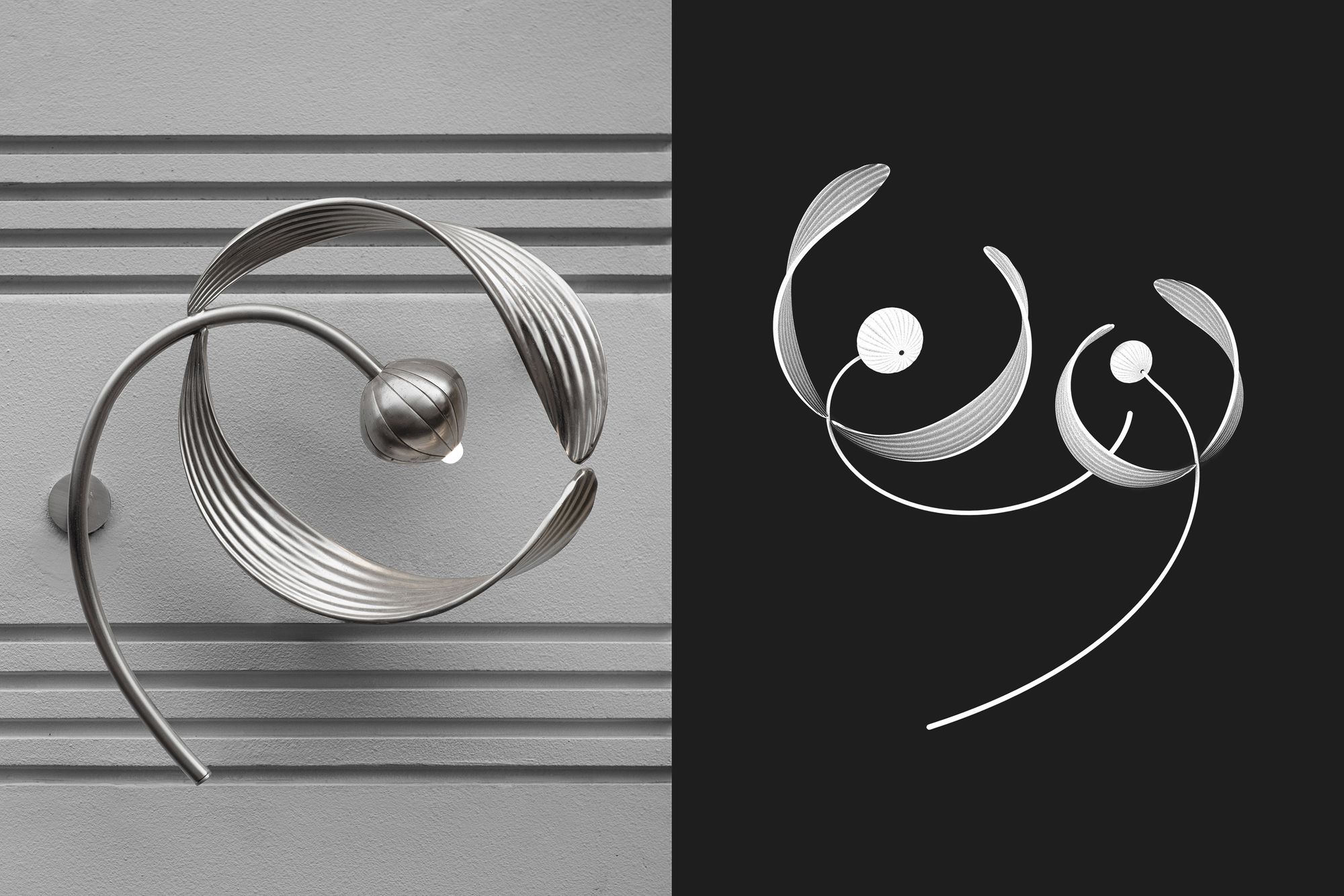
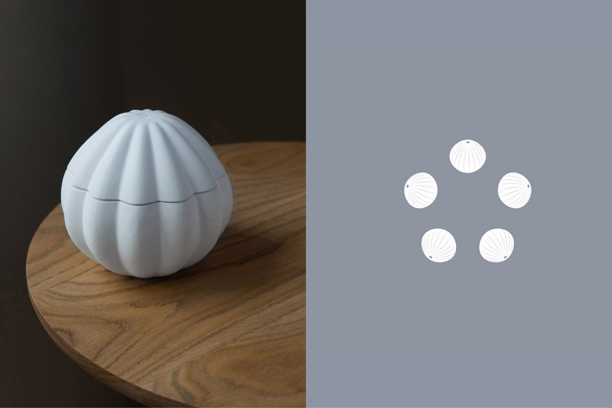
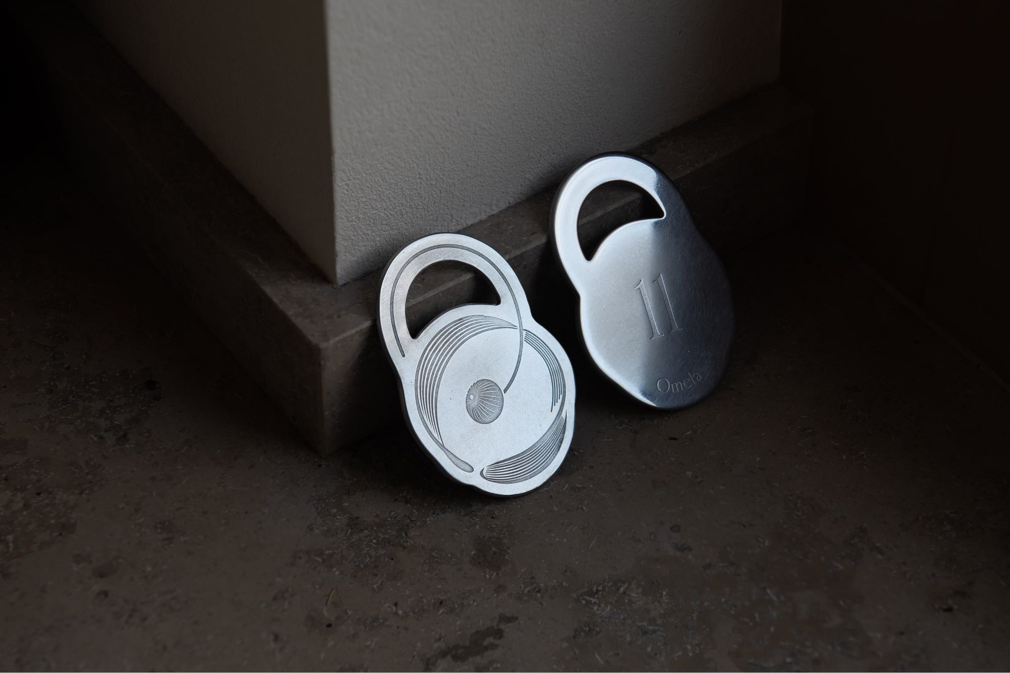
Beyond the logo, we conceived a minimalist yet versatile illustration system. This system serves as a visual reflection of the plant's romanticized allure. Within these illustrations lies the embodiment of the Omela flower, which not only captures its radiance but also symbolizes the profound connection between the restaurant's founding sisters.
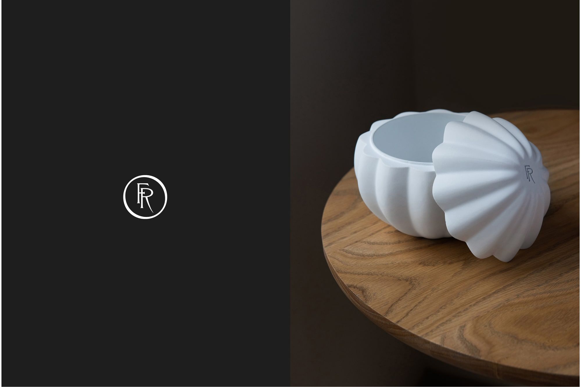
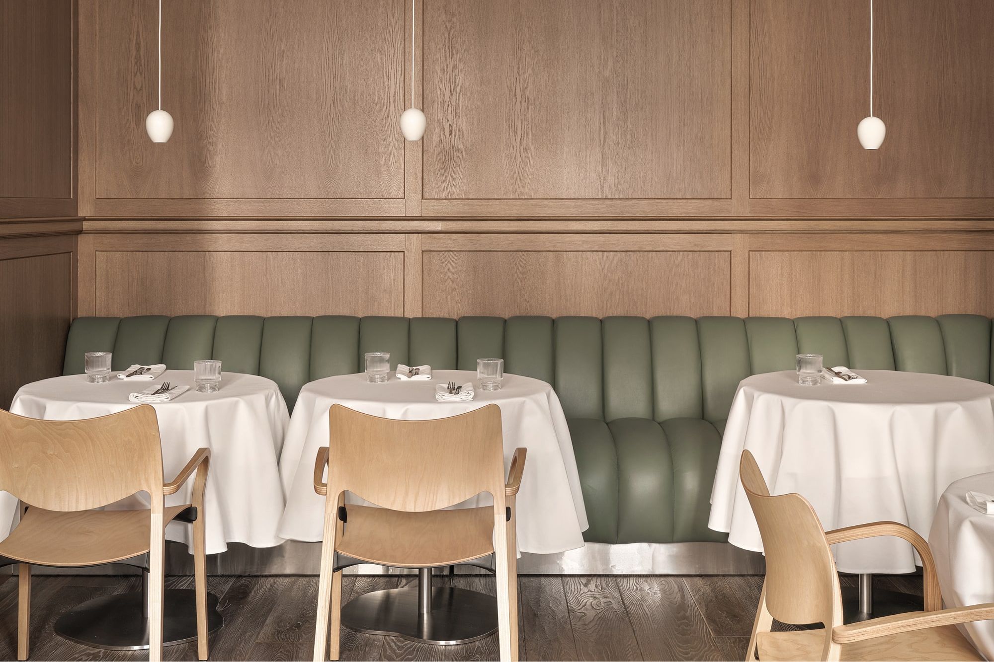
The Omela illustrations were created using Cinema 4D. This approach not only ensured their compatibility with print processes but also facilitated their seamless integration into animations. Additionally, these illustrations served as the foundation for the creation of volumetric interior objects, which we collaboratively designed and crafted with Fork Production. Examples include an elegant restaurant-front lamp and a meticulously designed 3D-printed bill box.

Art Direction & Design
Marina Kondratenko, Anna Kabanina, Nika Levitskaya
Illustration
Nika Levitskaya
Production
Fork Production
Photo
Daria Malysheva
